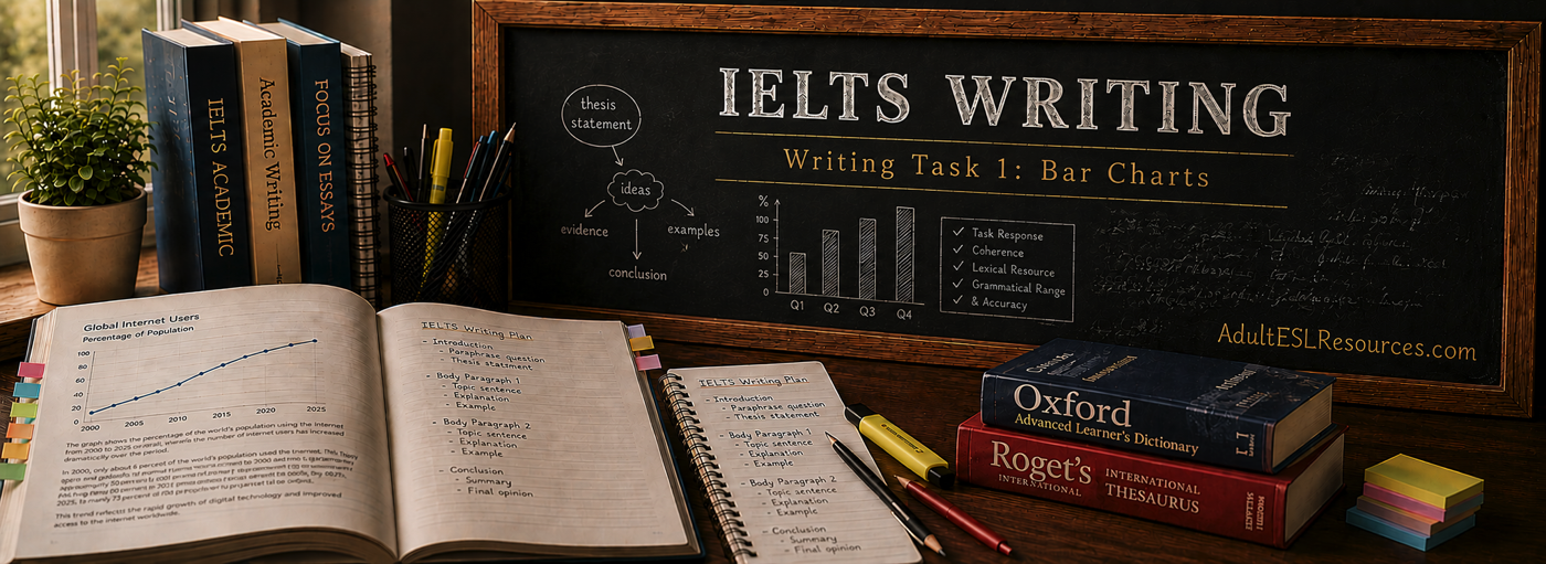
What you’re looking at
Bar Charts
A bar chart uses rectangular bars to compare quantities across different categories, or to compare the same category across different points in time. The height (or length, if the bars run horizontally) represents the value of each item.
You may be given a single bar chart, or two related bar charts to compare — for example, the same data shown for two different countries or two different years.

How to analyse it
Reading a bar chart before you write
Before writing a single sentence, study the chart with these questions in mind.
What is being compared?
Identify the categories on one axis and the measurement (percentage, number, currency) on the other.
What stands out?
Identify the highest bar, the lowest bar, and any categories that are notably close together or far apart.
Is there a pattern over time?
If the categories represent years or periods, look for an overall trend — rising, falling, or fluctuating.
What you should look for
Features worth reporting
The Highest and Lowest
The single largest and smallest bars are almost always worth mentioning in your overview.
Notable Gaps or Similarities
Two bars that are almost equal, or one bar that is dramatically larger than the rest, are significant features.
Vocabulary & terminology
Language for describing bar charts
Comparing
higher than / lower than
“significantly higher than,” “slightly lower than,” “roughly the same as”
Ranking
the largest / the smallest
“the largest proportion,” “the second-highest figure,” “the lowest of the four categories”
Change over time
rose / fell / remained stable
“increased steadily,” “fell sharply,” “remained relatively stable”
Common mistakes
What costs candidates marks
Describing Every Bar
Listing every single bar in order, rather than grouping similar values and highlighting what’s significant.
Guessing Reasons
Explaining why a value is high or low. Task 1 asks you to report the data, not interpret its causes.
Repeating One Structure
Using the same sentence pattern for every comparison, which makes the answer repetitive and limits your vocabulary score.
See it in practice
Example Task and Sample Answer
The example below is original and written for teaching purposes. It models the Task 1 bar chart format without reproducing official IELTS material.
Example IELTS Task
The bar chart below shows the percentage of households with internet access in four countries in 2010 and 2020.
Summarise the information by selecting and reporting the main features, and make comparisons where relevant.
Sample Answer
Sample Overview and Data Paragraph
The bar chart compares household internet access in four countries in 2010 and in 2020.
Overall, internet access increased in every country over the ten-year period, and the gap between the highest and lowest countries narrowed considerably.
In 2010, Country A had by far the highest rate of household internet access, at around 80%, while Country D had the lowest, at just under 30%. By 2020, however, Country D had risen sharply to approximately 75%, closing much of the gap with Country A, which itself increased only slightly to around 85%. Countries B and C followed a similar upward pattern, both reaching figures above 70% by the end of the period.
Why the Sample Works
Overview first, data second
The sample opens with a clear overview identifying the two most significant features — universal growth and a narrowing gap — before supporting them with specific figures. It reports the data objectively, without guessing why internet access grew, and it varies its comparison language rather than repeating the same sentence pattern.
Ready for the next step?
Explore another visual type or review the structure.
Structuring Your Answer
Review the overview-and-data framework that applies to every Task 1 visual.